Making Beautiful Tables with R
Adding Charts with Flextable
This lesson is called Adding Charts with Flextable, part of the Making Beautiful Tables with R course. This lesson is called Adding Charts with Flextable, part of the Making Beautiful Tables with R course.
Transcript
Click on the transcript to go to that point in the video. Please note that transcripts are auto generated and may contain minor inaccuracies.
Loading transcript...
Sparklines are small lines that help you to find trends in the data really fast. By now, they’re one of the standard tricks in the table trade. Here's how to add one in a flextable.
counts_over_time <- penguin_counts |>
  group_by(species, island, sex) |>
  summarise(collected_data = list(n)) |>
  ungroup()


counts_over_time |>
  flextable() |>
  compose(j = 'collected_data', value = as_paragraph(
    plot_chunk(value = collected_data, type = 'line', col = 'dodgerblue4')
))And here's how to add a boxplot to a table.
penguin_mass <- penguins |>
  group_by(species) |>
  summarise(body_masses = list(body_mass_g)) |>
  ungroup()

penguin_mass |>
  flextable() |>
  compose(
    j = 'body_masses',
    value = as_paragraph(
      plot_chunk(
        value = body_masses,
        type = 'dens',
        col = 'dodgerblue4',
        width = 3,
        height = 1
      )
    )
)Your Turn
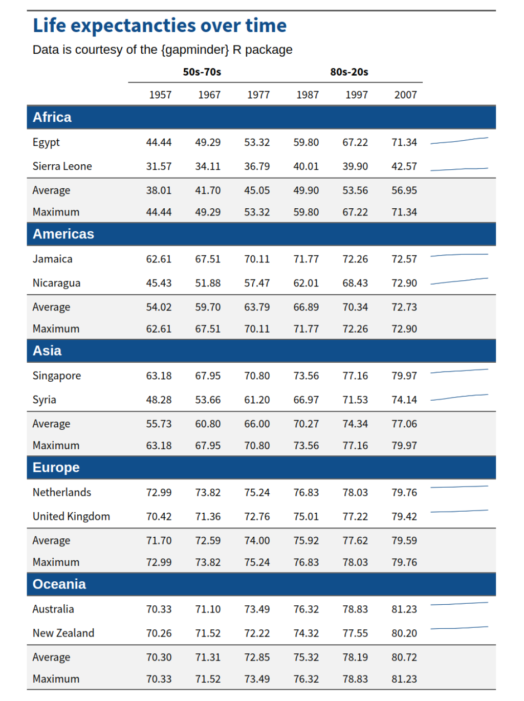
Instead of turning columns into a heat map, add another column to your table that contains a sparkline depicting the life expectancy over time for each country. If you don’t want to create sparklines for the average and maximum rows, then use value = as_paragraph('') in a second call to the compose() function.
Hint: If you want, you can manually change the width of the sparkline column with width() after autofit() was called.
Your table should look like this:
Have any questions? Put them below and we will help you out!
Course Content
16 Lessons
You need to be signed-in to comment on this post. Login.
Alex Rees • January 4, 2026
Hi team. If I copy and paste the first example, I get the following error: Error: object 'collected_data' not found
Same issue for the 2nd example. The object cannot be found.
Albert Rapp • January 6, 2026
Hi Alex,
that's a bit odd. Did perhaps some quotation marks get lost in the argument
j = "collected_data"? That would explain why thecollected_dataobject cannot be found becausejexpects the name of the targeted column. That's the only explanation I can think of. If I copy and paste the code from above, then everything works as expected. Perhaps you can copy-and-paste what code you run inside of R in here so that we can look if there is some copy-paste-mixup happening.Best, Albert