Making Beautiful Tables with R
Heat map columns
This lesson is called Heat map columns, part of the Making Beautiful Tables with R course. This lesson is called Heat map columns, part of the Making Beautiful Tables with R course.
Transcript
Click on the transcript to go to that point in the video. Please note that transcripts are auto generated and may contain minor inaccuracies.
Loading transcript...
This lesson covers heat maps. These are tables where one, multiple or all cells have a background color which is chosen according to some numeric value Heat maps are great for helping your reader find the important values or the high or low values immediately.
bg_color_fct <- scales::col_numeric(palette = "viridis", domain = c(0, 30), na.color = 'white')
text_color_fct <- function(x) if_else(x < 20 & !is.na(x), 'white', 'black')

## Source needs to take the grouped data into account. That's why it's shifted by one.
final_table |>
  bg(i = ~(year %in% 2007:2009), j = 2:7, bg = bg_color_fct, source = 3:8) |>
color(i = ~(year %in% 2007:2009), j = 2:7, color = text_color_fct,source = 3:8) Your Turn
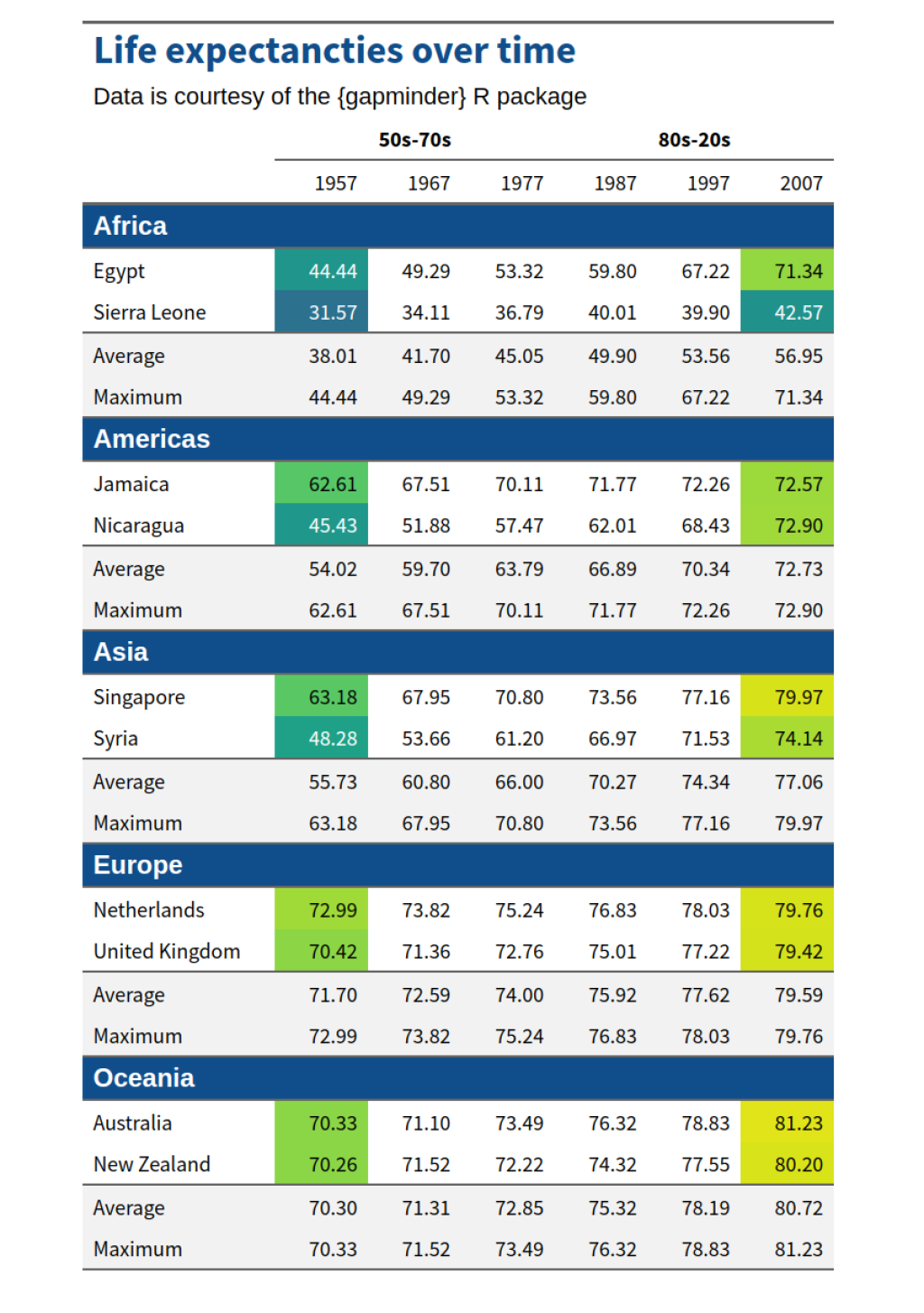
Turn the 1957 and the 2007 columns (without the average and maximum rows) into a heatmap. Your background color function should use a domain from zero to 85. Also make sure that texts that correspond to values below 50 use white text and black text otherwise. Your table should look like this:
Have any questions? Put them below and we will help you out!
Course Content
16 Lessons
You need to be signed-in to comment on this post. Login.