Making Beautiful Tables with R
Align columns
This lesson is called Align columns, part of the Making Beautiful Tables with R course. This lesson is called Align columns, part of the Making Beautiful Tables with R course.
Transcript
Click on the transcript to go to that point in the video. Please note that transcripts are auto generated and may contain minor inaccuracies.
Loading transcript...
Next step is to align columns. As you as you can see, for example, in our spanners, the cells use right aligned texts. That’s not particularly nice to read, especially because this species name should always refer to the two cells below it. So it would be great if the text in that cell is centered.
For readability of your tables certain data types should use different alignments. For example, for texts it’s best if you use left alignment. That’s because we read from left to right and if all the texts are aligned at the same vertical line, then it’s easier to read. Otherwise, our eyes always have to find the beginning of the next line.
For numbers it’s different. There, you should move everything to the right. This way, you can easily compare digits one by one.
flextable(penguin_counts_wider) |>
  set_header_labels(
    island = 'Island',
    year = 'Year',
    Adelie_female = 'Female',
    Adelie_male = 'Male',
    Chinstrap_female = 'Female',
    Chinstrap_male = 'Male',
    Gentoo_female = 'Female',
    Gentoo_male = 'Male'
  ) |>
  add_header_row(
    values = c('', 'Adelie', 'Chinstrap', 'Gentoo'),
    colwidths = c(2, 2, 2, 2)
  ) |>
  add_header_lines(
    values = c('Penguins in the Palmer Archipelago', 'Data is courtesy of the {palmerpenguins} R package')
  ) |>
  align(i = 3, align = 'center', part = 'header') |>
  # it's already left-aligned but for demo purposes we do it again
  align(j = 'year', align = 'right', part = 'body') |>
autofit()Your Turn
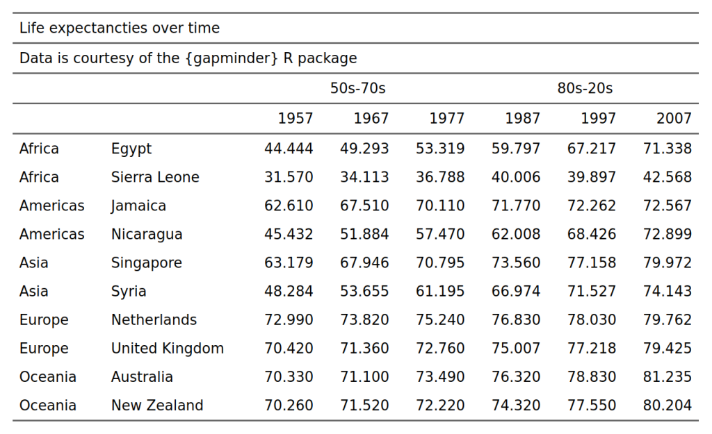
Center the spanners, i.e. the group labels "50s-70s" and "80s-20s". After the exercise, your table should look like this:
Have any questions? Put them below and we will help you out!
Course Content
16 Lessons
You need to be signed-in to comment on this post. Login.
Jennifer Irving • January 15, 2024
Hi! My flextable is defaulting to having the title and header lines aligned to the right. Could you share some additional code examples to change the alignment? I would like these to be left-aligned (like the example) or centered. I'm working on my own data but the code if from the examples from this course (below):
Thanks!
David Keyes Founder • January 15, 2024
It's a bit hard to know for sure without seeing your data, but this might work:
Jennifer Irving • January 15, 2024
Thank you so much! That got me 95% of the way there. I now have better understanding of the "i" and "part" arguments of the align function and was able to align my table the way I wanted to.