Declutter
This lesson is called Declutter, part of the Going Deeper with R course. This lesson is called Declutter, part of the Going Deeper with R course.
Transcript
Click on the transcript to go to that point in the video. Please note that transcripts are auto generated and may contain minor inaccuracies.
View code shown in video
# Load Packages -----------------------------------------------------------

library(tidyverse)
library(fs)

# Create Directory --------------------------------------------------------

dir_create("data")

# Download Data -----------------------------------------------------------

# download.file("https://github.com/rfortherestofus/going-deeper-v2/raw/main/data/third_grade_math_proficiency.rds",
#               mode = "wb",
#               destfile = "data/third_grade_math_proficiency.rds")

# Import Data -------------------------------------------------------------

third_grade_math_proficiency <-
  read_rds("data/third_grade_math_proficiency.rds") |>
  select(academic_year, school, school_id, district, proficiency_level, number_of_students) |>
  mutate(is_proficient = case_when(
    proficiency_level >= 3 ~ TRUE,
    .default = FALSE
  )) |>
  group_by(academic_year, school, district, school_id, is_proficient) |>
  summarize(number_of_students = sum(number_of_students, na.rm = TRUE)) |>
  ungroup() |>
  group_by(academic_year, school, district, school_id) |>
  mutate(percent_proficient = number_of_students / sum(number_of_students, na.rm = TRUE)) |>
  ungroup() |>
  filter(is_proficient == TRUE) |>
  select(academic_year, school, district, percent_proficient) |>
  rename(year = academic_year) |>
  mutate(percent_proficient = case_when(
    is.nan(percent_proficient) ~ NA,
    .default = percent_proficient
  ))

# Plot --------------------------------------------------------------------

top_growth_school <-
  third_grade_math_proficiency |>
  filter(district == "Portland SD 1J") |>
  group_by(school) |>
  mutate(growth_from_previous_year = percent_proficient - lag(percent_proficient)) |>
  ungroup() |>
  drop_na(growth_from_previous_year) |>
  slice_max(order_by = growth_from_previous_year,
            n = 1) |>
  pull(school)

third_grade_math_proficiency |>
  filter(district == "Portland SD 1J") |>
  mutate(highlight_school = case_when(
    school == top_growth_school ~ "Y",
    .default = "N"
  )) |>
  mutate(school = fct_relevel(school, top_growth_school, after = Inf)) |>
  ggplot(aes(x = year,
             y = percent_proficient,
             group = school,
             color = highlight_school)) +
  geom_line() +
  scale_color_manual(values = c(
    "N" = "grey90",
    "Y" = "orange"
  )) +
  theme_minimal() +
  theme(axis.title = element_blank(),
        legend.position = "none",
panel.grid = element_blank())Your Turn
Using a combination of a complete theme and the theme() function:
Remove the gray background
Remove axis titles
Remove the legend
Remove or minimize grid lines
Learn More
Check out this video from Storytelling with Data, which explains the power of decluttering.
To learn more about how to declutter in ggplot, ggplot2: Elegant Graphics for Data Analysis (3e) Chapter 17.
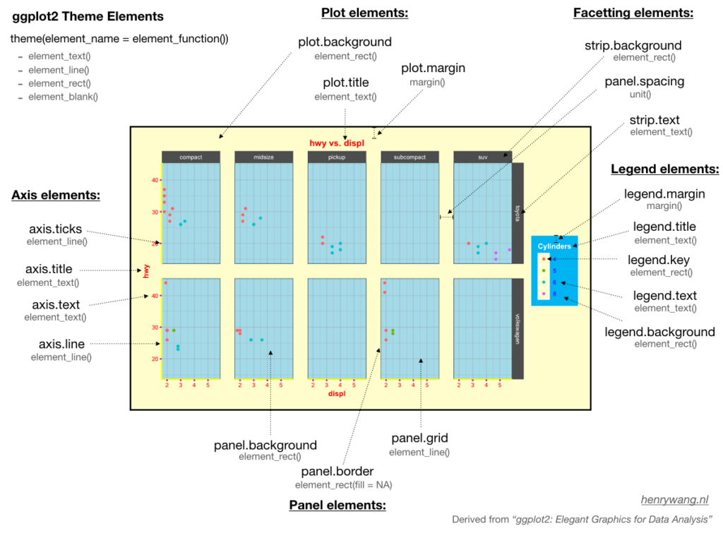
To learn about all of the theme elements you can customize, check out the ggplot2 documentation website. You might also be interested in Henry Wang's diagram to help you understand working with themes.
Have any questions? Put them below and we will help you out!
Course Content
44 Lessons
You need to be signed-in to comment on this post. Login.