Line Charts
This lesson is called Line Charts, part of the Going Deeper with R course. This lesson is called Line Charts, part of the Going Deeper with R course.
Transcript
Click on the transcript to go to that point in the video. Please note that transcripts are auto generated and may contain minor inaccuracies.
View code shown in video
# Load Packages -----------------------------------------------------------

library(tidyverse)
library(fs)

# Create Directory --------------------------------------------------------

dir_create("data")

# Download Data -----------------------------------------------------------

# download.file("https://github.com/rfortherestofus/going-deeper-v2/raw/main/data/third_grade_math_proficiency.rds",
#               mode = "wb",
#               destfile = "data/third_grade_math_proficiency.rds")

# Import Data -------------------------------------------------------------

third_grade_math_proficiency <-
  read_rds("data/third_grade_math_proficiency.rds") |>
  select(academic_year, school, school_id, district, proficiency_level, number_of_students) |>
  mutate(is_proficient = case_when(
    proficiency_level >= 3 ~ TRUE,
    .default = FALSE
  )) |>
  group_by(academic_year, school, district, school_id, is_proficient) |>
  summarize(number_of_students = sum(number_of_students, na.rm = TRUE)) |>
  ungroup() |>
  group_by(academic_year, school, district, school_id) |>
  mutate(percent_proficient = number_of_students / sum(number_of_students, na.rm = TRUE)) |>
  ungroup() |>
  filter(is_proficient == TRUE) |>
  select(academic_year, school, district, percent_proficient) |>
  rename(year = academic_year) |>
  mutate(percent_proficient = case_when(
    is.nan(percent_proficient) ~ NA,
    .default = percent_proficient
  ))

# Plot --------------------------------------------------------------------

third_grade_math_proficiency |>
  filter(district == "Portland SD 1J") |>
  view()

third_grade_math_proficiency |>
  filter(district == "Portland SD 1J") |>
  ggplot(aes(x = year,
             y = percent_proficient)) +
  geom_line()

third_grade_math_proficiency |>
  filter(district == "Portland SD 1J") |>
  ggplot(aes(x = year,
             y = percent_proficient,
             group = school)) +
geom_line()Your Turn
Make a line chart that shows the change in the Hispanic/Latino population in school districts from 2021-2022 to 2022-2023.
Learn More
There are also spins on line charts that you can easily make by adjusting your geom. For example, you can use geom_area() to make area charts.
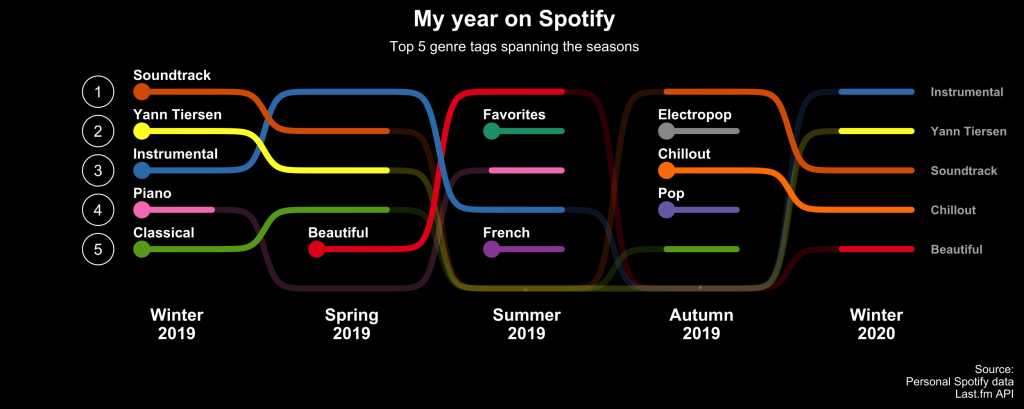
There are also extensions that take idea of line charts further. Here is a plot made with the ggbump package, for instance, which enables you to make slopegraphs (another cousin of line charts) with curves.
Have any questions? Put them below and we will help you out!
Course Content
44 Lessons
You need to be signed-in to comment on this post. Login.